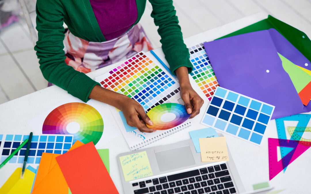
Five Amazing Color Tools for Designers
Color is a power which directly influence the soul. A perfect combination of colors can put life to any piece of art or any object. Therefore, to make any object more attractive and appealing , designers need to be very particular while designing anything. They have to look for the perfect color combination according to the requirements of the client .Choosing the best color tools for designers is a hard task and requires someone with good coloring sense to accomplish this task.
Here are some amazing color tools for designers described below…
5 Best Color Tools for Designers to Craft a Masterpiece
The phycology of colors is very important in designing. If your brand doesn’t have right color combination in your website or digital assets, your website won’t be visual appealing to your audience.
As of now let’s have an overview of these tools which play the role of a helping hand to the designers .
1. Khroma
It is an AI color tool for designers . It helps the designers to discover , search and save color combinations that you’ll love. Khroma is the fastest way to generate , discover ,search and save color combos .
Khroma has learned from thousands of the most popular human made palettes across the internet to produce great combos.
Khroma’s search allows you to filter the generator by the hue , tint, value ,color , as well as hex and rgb values. You can create unlimited library of your favorite combos to reference later.
2. Color Hunt
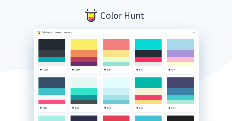
This is a platform which provides thousands of trendy hand picked color palettes. It is a free and open platform. It is a curated collection of beautiful colors , updated daily. It serves thousands of color schemes for many different design and art purposes.
Anyone can save their favorite palettes ,manages their personal collection , and have a quick access to copy the color codes . When clicking on the like button the palette, it’s saved on your browser’s “local storage.” Therefore, you can access it and manage your personal collection without the need of logging in to color hunt .
3. Culrs
Culrs gives the designers a simple smart approach to choose color palettes. Culrs is an open platform for the user to choose color palettes for their application with extreme ease .
Curls is a product that is constantly updating and learning the color theory and science of colors from all over the internet ,as well as the strategic color theory concepts used by some of the great products that people have already adapted to, in their daily life .

4. Coolers
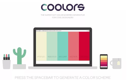
It is the super fast color scheme generator. You can customize your colors precisely by adjusting temperature, hue , saturation , brightness etc.
You can even export your palettes in several handy formats like PNG , PDF, SCSS, SVG or copy the permanent URLs . By creating your profile you can keep all your color schemes well organized with name and tags . You can create , save and share perfect palettes in seconds .
5. Color Leap
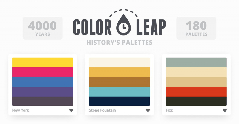
Discover the history of color palettes throughout the past 4000 years. The tagline says , “Take a leap through time and see the colors of history .”
It is a collection of 180 color palettes that showcase colors used throughout 12 distinct eras in history. Each palette were created by sampling pieces of artwork in the time period.
These are some amazingly color tools platforms for designers which can be very useful and make the work of not only of designers but of every individual who find it difficult to look for a perfect color combination much easier.
What is 60-30-10 Rule of Designers?
After choosing the best color tools for designers, it’s crucial for you to understand the rule. The 60-30-10 rule is a popular guideline particularly used in web design and graphic design. It is to create visually balanced and harmonious color schemes. Here’s what you need to know:
- 60% Dominant Color: This is the primary color that takes up the most space in your design. It often forms the background or main body of your content.
- 30% Secondary Color: Supporting color that complements the dominant color and adds depth to your design. Also, used for larger elements but less than the dominant color.
- 10% Accent Color: This is a contrasting or highlight color used sparingly to draw attention to specific elements or create visual interest. Thus, used in the smallest proportion of the three colors.
By following this rule, you can ensure your design isn’t overwhelming. The dominant color provides a foundation, the secondary color adds structure, and the accent color creates pops of interest.
Bottom Line!
“Life is too short to live in black and white.”
These days people have become too peculiar for choosing a perfect color scheme whether it is for the painting of house or the color of the dress . Some are good at dealing with colors while others are not. So, keep in mind need of your brand’s visual appearance and also the importance of colors in their daily life.
Hence, read our other blog post on types of logo design to master the graphic designing practices and if you want more blog posts like this, subscribe to our newsletter.
